What is absolutely important to mention about cold colors is that they should only be used on larger surfaces in rooms with sufficient natural light. The cold colors used on brighter, larger surfaces somewhat narrow the space, which, however, can be compensated for by the appropriate light conditions. Of course, in addition to rooms bathed in natural light, cold shades can also often be found in bathrooms and toilets, but we do not spend so much time in these rooms that cold colors create a feeling of coldness in us.
The above-mentioned harsh effect can be easily offset with warm colors, or white, champagne, cherry shades, or muted cold colors. Let's take a look at the most commonly used cold colors and their effects.
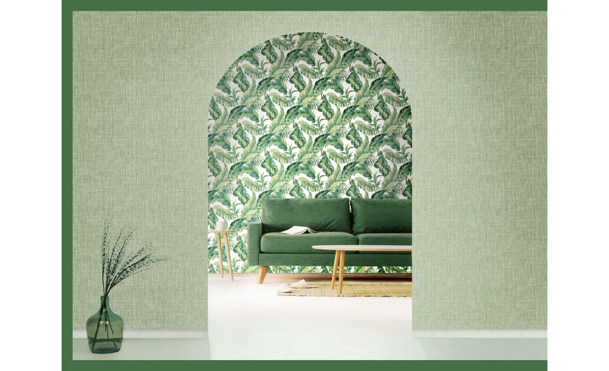
One of the most popular cold colors is probably green. Although green is usually classified as a cold color, due to its natural nature, it radiates warmth. Green is perhaps one of the most soothing colors, although you have to be careful which shade you use, as the room can easily become oppressive due to the many shades of dark and poisonous green. Perhaps it stems from the natural effect of green, that it looks good with almost any color, in fact, a bright green wallpaper simply requires colorful accessories and furniture. Orange, yellow, bishop's purple, red, blue, brown, or champagne color. All of these perfectly harmonize with green, and if we stick to the principle of moderation, we won't find a piece of furniture in a color that doesn't look good next to a green wallpaper. If we want to keep the youthful atmosphere inherent in green, then we should prefer light, bright green shades, because darker green colors can create a slightly old effect.
Similar to burgundy, darker purple has a kind of aristocratic elegance, but when applied on too large surfaces, this color can easily become overwhelming. In addition, different shades of purple can simultaneously hide a sense of mysterious spirituality and intimate shyness. According to some, too many purple surfaces can make the home look theatrical, but this effect can also be easily compensated. If we use a lot of white, champagne-colored or light purple accessories and furniture in addition to a brighter purple wallpaper, the room will feel warmer, but in combination with a darker shade of blue or even gray, the room can maintain a somewhat cold effect.
Perhaps one of the coldest colors left at the end is blue. Despite the fact that this color of water is not only found in bathrooms, it is a fact that it occurs very often in this room. Nowadays, turquoise is considered one of the most fashionable shades, but due to its dominant effect, it does not hurt to be careful when using it. Different shades of blue look very good with gray, brown, yellow, or even green. If we want to enhance the effect of a light blue wallpaper, we can easily do so with some lighter orange accessories, with which a very pleasant contrast can be achieved.